 |
Please write: dan@dancooper.tv
Return to Page One
Register here to receive Fashion Finds
email updates!
 William Ivey Long: I did read Damon Runyon’s stories. And I read about three of his novels, and then I watched a film that really got me. That was Lady For A Day, directed by Frank Capra. And Capra later remade it with Bette Davis, Pocket Full of Miracles. You may have seen it. FF: Yes, I have seen it. William Ivey Long: And it was a Cinderella story,
about an old lady who had a daughter, you know. And it really helped me realize that these
Runyon characters were gentlemen. Dave the Dude really was Dave the Dude. And they really
were gentlemen. And they had their own code of chivalry, and their own language, that
amazing concoction of -- of Runyonese which is very high-falutin and, you know, elaborate.
And it helped -- I sort of put it in the mix. |
 I do a lot of my designing when I’m in a bathtub. Because it takes all other thoughts away, and it’s just your brain floating in water. Anyway that’s what I do in the bathtub. And it just came to me that I could do the suits in
these wild colors if I kept to strict silhouette and strict construction methods. |
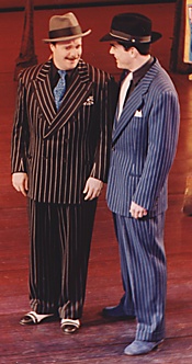
 So we were vigilant. We did not allow a single man to wear a single bit of makeup on his face, because the minute you would do that -- I just thought the minute you do that they’d go right into caricature. We picked late Forties because there’s a lyric
in the song Take Back Your Mink -- "it was late forty eight I recall ..." So we
decided, okay, late Forties, which is a beautiful period for men’s suits. Gary
Cooper, Cary Grant, come on! So, I personally -- I set the period. |
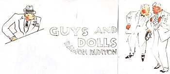
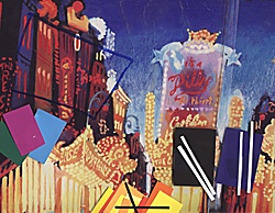
 FF: Yes! How did your work on Guys and Dolls begin? William Ivey Long: I think this is probably my best design. Did I just say that? It was just a privilege when Jerry Zaks, with whom
I’ve done over a dozen shows, asked me to do this with Tony Walton, because I would
say Tony Walton created Runyonland and I peopled it. And as you see in that one collage,
boy, presented with that world, where do you go? |
 |
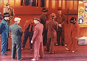
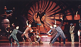
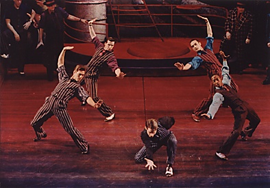
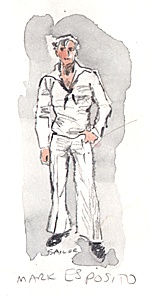
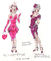
Now, Guys and Dolls is all about the men.
And what I did was, I started with the main character (Nathan Lane as Nathan Detroit).
When you’ve got Technicolor, how do you find the main character in front ? You put
the main character in black. So it’s the one non-color. Of course black is the
presence of all color.
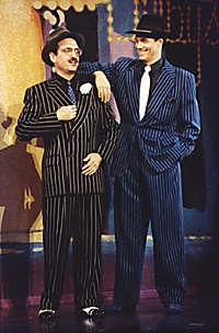
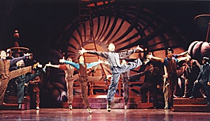
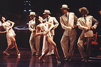
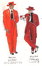
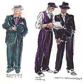
 Nathan Lane and Peter Gallagher And then I put the second leading man in classic leading man blue, and it was Peter Gallagher (as Sky Masterson), so of course all eyes were on him anyway. And then oddly enough, the people who were on the periphery, in order to make someone disappear, I would put them in a bright orange suit. I know that sounds absolutely insane, but because the shadows were bright orange and bright, you know, magenta and stuff, those warm/hot colors were the colors I used for disappearing. And it was the contrasting colors that I used to find the people. So every theory was turned upside down. In Act I, in Runyonland, front and center, the Times Square area in Act I, that was the brightest. And so the color schemes were extremely potent. In Act II, when we went literally down into the
earth, to the cellars, everything was, by the nature of going down underground, darker. It
was also at night. So everyone, all the gangsters, had two costumes: similar cut, similar
color scheme, but one was the brighter, and one was the darker. |
 |
 |
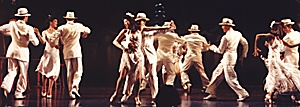
 Some of my friends -- my friends even! -- didn’t know the costumes had changed. They thought it was the lighting. But of course I had done it on purpose, to make it like the night scene, and also to pull the intensity down. It’s like, can you stay on your jogging path all day long and all night long? No. You have to rest. You have to rest your eyes. And then, when we went to Havana,
Havana, Cuba, of course, you know everyone wears white suits there. Everyone wears their
white straw hats and their white suits. So that was all white and cream. Actually it wasn’t
white, it was cream, which looked white. It’s softer than white with the effect of
white. And then it was also a rest. Let’s go to Havana and rest. |
 |
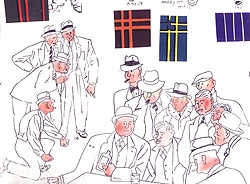
 Then, when they came back in those beautiful Tony Walton drops of the early, early morning, with the lyrics about the milk man and you saw the rain, those were cooler colors. So I saved the razzle dazzle for front and center. And I think working, as you see on
these bible pages, it was just wonderful to be able to do a spread sheet of all the colors
with all the possibilities, and then to develop them from these tiny little thumbnails
into reality. |
 |
 |
 |
 |